
Spatial Visualization
This component focuses on visualizing COVID-19 symptoms across different geographic locations. COVID19α provides two types of spatial visualizations:
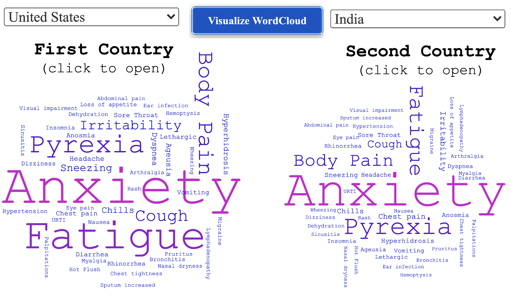
Twitter Word Cloud: Comparative WordCloud Visualization between two geographic locations.
Clustered Symptom Map: Multi-level granularity based spatial distribution of COVID-19 symptoms through an interactive map interface.
Temporal Visualization
This component presents the visualization of the time-series of COVID-19 symptoms for a particular geographic location. COVID19α provides users with options to create visualizations for a specific subset of symptoms depending on their interests, allowing them to see those symptoms’ evolution patterns over time:
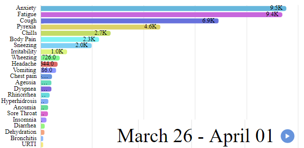
Dynamic Temporal Simulation: Bar Chart Visualization of worldwide symptom distribution over time.
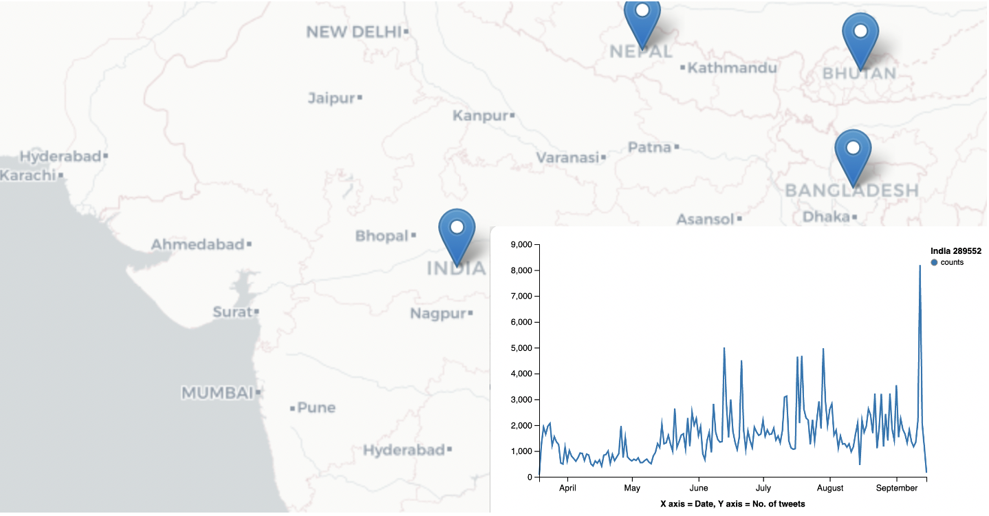
Time-series Map: Multi-level granularity based spatial distribution of COVID-19 symptoms through an interactive map interface.
-
All Tweets: The map contains time series plots of all covid-19 related tweets for different locations.
-
All Symptoms: The map contains time series plots of all covid-19 ‘symptom-tweets’ for different locations.
-
Individual Symptom: The map contains time series plots of ‘symptom-tweets’ of a particular covid-19 symptom.
Spatio-Temporal Visualization
The third and last component of COVID19α combines both spatial and temporal analysis to provide comparative visualizations between two countries or two symptoms:
Spatio-Temporal Evolution between Two Symptoms: Comparative Bar Chart Visualization of affected countries over time between two symptoms.
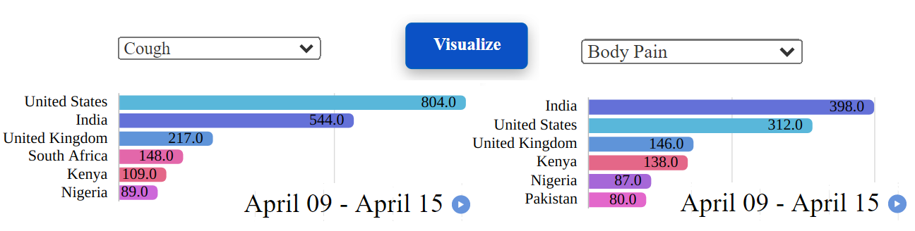
Temporal Evolution of Symptoms between Two Countries: Comparative Bar Chart Visualization of symptom distribution over time between the two selected countries.